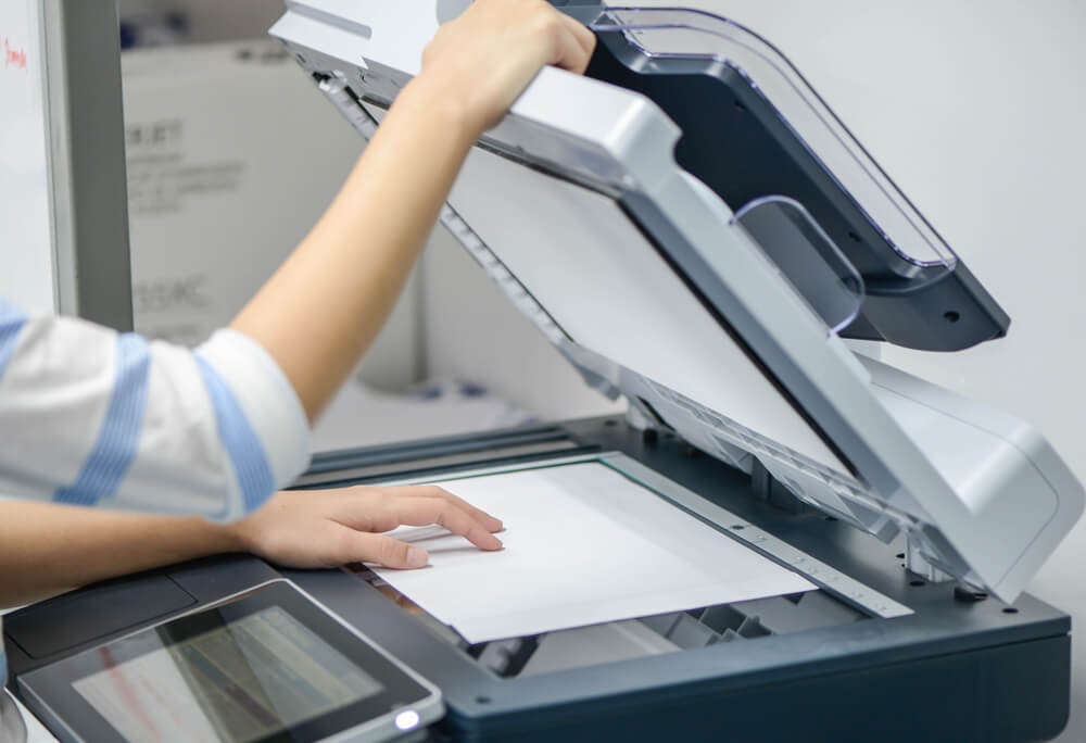
Understanding how printing works and knowing the terminologies is important for those with copiers. If you think it does not apply to you, you need to consider that at some point, a client will ask for print components, or an employee will ask you questions about the copier. Knowing the printing basics and terminology will help you to understand your copier better.
Here are three terminologies that you need to know:
DPI
DPI is dots per inch, and it is a measure of printing quality. A lot of copiers work by making tiny dots per square inch to create an image; more dots equal greater accuracy and detail.
But there is a limit to the number of dots per inch that the eye can see. Usually, 300 and 600 DPI are the standards for most print jobs, depending on the kind of paper and printer that is used. Lighter weight papers print with lower DPI when colors run together and potential ink over-saturation of paper. Laser-style copiers on high-quality or glossy paper usually run at a higher DPI.
It is important to note that increasing the DPI will increase the file size. It is recommended to save each file at the print DPI properly to maintaining filing efficiency.
Most software tools like InDesign or Adobe’s Photoshop include measurements in DPI; they only refer to print design. DPI does not mean anything when it comes to digital projects since the screen resolution is not measured in the same way. Digital resolution is measured in pixels.
DPI is not a tool that can change the size or the quality of an image. Increasing the DPI will not make an image sharper or better the quality of it.
Mono vs. Duotone Color
Duotone color and monotone are similar in look, but they are different in composition. Both of these color types refer to a grayscale image with a color cast. Monotone and duotone images can appear black and white or colored. This kind of technique is usually used to make a more artistic or old feel for an image.
Monotones are made by printing a grayscale image with single-color ink that is not black. So on a typical CMYK or the four-color process printing (Cyan, Magenta, Yellow, and Black), a monotone would be magenta, cyan, or yellow. Monotone images with low saturation of ink look less colorful and more grayscale than those with higher ink lay.
Duotones, on the other hand, are grayscale images that are printed using numerous inks. Duotone printing can make a rich grayscale image and is ideal for spot color processes. Duotone processes,unlike monotone printing, can include the use of black ink.
RIP
RIP or raster image processor is used in printing to make a raster image suitable for printing. This process can turn any file, raster or vector, images or text, into a single high-resolution file that is readable by printing equipment. A RIP is technically a software or firmware, and the actual process turns files into a bitmap for printing.
Packaging files properly is important for the RIP process, and the software needs to be able to detect and read all of the file information. As files are converted to a single image, fonts and images must be flattened and read. This is why you are asked to include a link and to include the font files with projects designed for printing.
These are just some of the terminologies that would be helpful once you get a copier. If you wish to get a copier for your office, you can always lease one and contact your local leasing company to assist you. For example, if you need a copier in Buffalo, you can call Buffalo (716) 616-3718. They can assist you with copier lease in Buffalo, copier rental in Buffalo, and copier repair in Buffalo.
